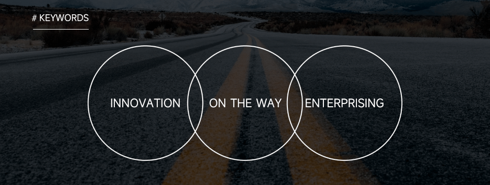
Taking "N" as the basic graphic, transforms from near to far into the road and continues to extend to the distance, and climbs the peak bravely, implying the core concept of Century United: innovation, we are on the road, Every time you set off, your mentality returns to zero, and you move forward bravely...Towards infinity, to zero, everything is possible; "1" and "V" mean ideas and victory.
70% of visual impressions people remember come from color. Being able to understand the information of color is people's innate instinct, and it also contains people's cognition of the world. The charm of color is that it can directly express rich emotions without relying on any form. It is a special language. Therefore, making good use of the language of color will help us deliver accurate messages. How to choose the right color combination for Century United's brand visual design can start from understanding the color language.
70% of visual impressions people remember come from color. Being able to understand the information of color is people's innate instinct, and it also contains people's cognition of the world. The charm of color is that it can directly express rich emotions without relying on any form. It is a special language. Therefore, making good use of the language of color will help us deliver accurate messages. How to choose the right color combination for Century United's brand visual design can start from understanding the color language.
The brand logo consists of the brand graphic logo and the wordmark, which is an important visual identity element for our external communication. The proportions of the elements in the logo have been optimized. Under no circumstances should the shape of the logo be altered or its constituent elements be dismantled. Always use the standard version of the brand identity to establish a standard for brand identity and maintain consistency in identity communication.

Our Products
Our Culture
Contact Us
Contact us
400-606-1976
Fax
0533-3781296